UI / UX Design
Postr Mobile App
Enabled cross platform alignment by grounding design decisions in shared technical and business constraints.
Year :
2024-Present
Industry :
Marketing
Client :
Postr
Project Duration :
Ongoing
Three Users. One Product. A Lot of Complexity.
Influencer marketing looks simple from the outside: brands find creators, creators make content, campaigns go live.
Underneath, it’s anything but simple.
Three very different users are constantly making different decisions:
Creators ask: “Is this campaign worth my time?”
Advertisers ask: “Who can actually deliver for my brand?”
Recruiters ask: “How do I find the right talent?”
I designed a 0–1 mobile product to bring these worlds together without making any of them feel like an afterthought.
I Didn’t Want to Show More Data. I Wanted to Show the Right Data.
The platform had no shortage of information.
Audience demographics. Engagement rates. Campaign performance. Budgets. Deliverables. Creator profiles. Recruitment pipelines. Brand requirements.Etc…
The problem?
More doesn't automatically better.
If anything, it can create cognitive overload.
When you have access to a lot of data, it's easy to mistake more information for more value.
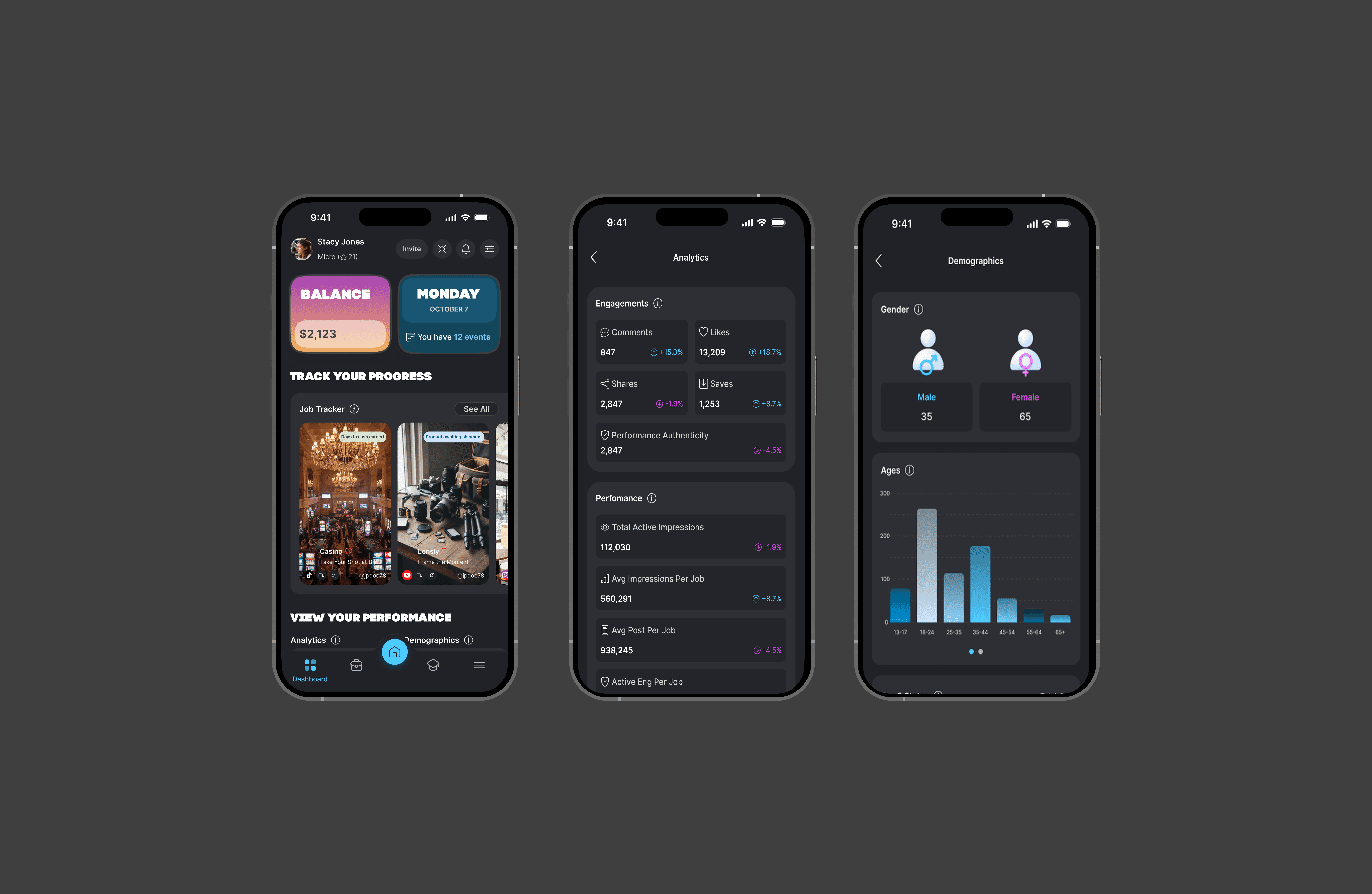
Instead of presenting a collection of performance numbers in isolation, I structured information into meaningful groups and established a clear hierarchy so users could understand not only what a metric was, but why it mattered within the broader context of their goals. Key signals were surfaced first, while supporting details were available when users wanted to explore further. This approach transformed analytics from something users had to decode themselves into something that could actively support a decision.
From Pixels to Proof
A great product experience shouldn't just look good in a portfolio.
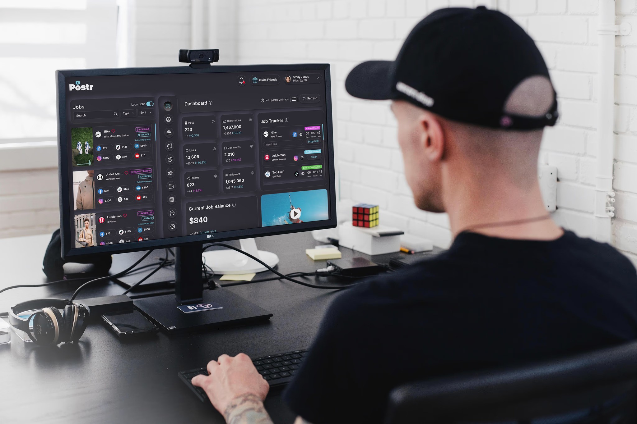
It should move numbers. The design could create momentum before the product was even fully launched.
The answer showed up in two tangible signals:
60K Instagram followers.
3K app downloads before the full launch.
These weren't vanity metrics I designed toward in isolation. They became evidence that the product's visual identity, positioning, and experience were resonating with an audience before the platform had reached its full potential.
The Biggest Thing I'd Take Forward
I learned how to take an ambiguous 0–1 problem, break it into distinct user needs, create a design system, simplify complex information, and build experiences that could support multiple sides of a marketplace.
But more importantly, I learned where the next level of my practice needs to go.
I want to become more rigorous about connecting design decisions to measurable product outcomes, not just asking whether an interface is intuitive, but whether it changes behavior.
Because ultimately, the strongest design isn't the one that looks the best in a portfolio.
It's the one that changes what people do.
UI / UX Design
Postr Mobile App
Enabled cross platform alignment by grounding design decisions in shared technical and business constraints.
Year :
2024-Present
Industry :
Marketing
Client :
Postr
Project Duration :
Ongoing
Three Users. One Product. A Lot of Complexity.
Influencer marketing looks simple from the outside: brands find creators, creators make content, campaigns go live.
Underneath, it’s anything but simple.
Three very different users are constantly making different decisions:
Creators ask: “Is this campaign worth my time?”
Advertisers ask: “Who can actually deliver for my brand?”
Recruiters ask: “How do I find the right talent?”
I designed a 0–1 mobile product to bring these worlds together without making any of them feel like an afterthought.
I Didn’t Want to Show More Data. I Wanted to Show the Right Data.
The platform had no shortage of information.
Audience demographics. Engagement rates. Campaign performance. Budgets. Deliverables. Creator profiles. Recruitment pipelines. Brand requirements.Etc…
The problem?
More doesn't automatically better.
If anything, it can create cognitive overload.
When you have access to a lot of data, it's easy to mistake more information for more value.
Instead of presenting a collection of performance numbers in isolation, I structured information into meaningful groups and established a clear hierarchy so users could understand not only what a metric was, but why it mattered within the broader context of their goals. Key signals were surfaced first, while supporting details were available when users wanted to explore further. This approach transformed analytics from something users had to decode themselves into something that could actively support a decision.
From Pixels to Proof
A great product experience shouldn't just look good in a portfolio.
It should move numbers. The design could create momentum before the product was even fully launched.
The answer showed up in two tangible signals:
60K Instagram followers.
3K app downloads before the full launch.
These weren't vanity metrics I designed toward in isolation. They became evidence that the product's visual identity, positioning, and experience were resonating with an audience before the platform had reached its full potential.
The Biggest Thing I'd Take Forward
I learned how to take an ambiguous 0–1 problem, break it into distinct user needs, create a design system, simplify complex information, and build experiences that could support multiple sides of a marketplace.
But more importantly, I learned where the next level of my practice needs to go.
I want to become more rigorous about connecting design decisions to measurable product outcomes, not just asking whether an interface is intuitive, but whether it changes behavior.
Because ultimately, the strongest design isn't the one that looks the best in a portfolio.
It's the one that changes what people do.
UI / UX Design
Postr Mobile App
Enabled cross platform alignment by grounding design decisions in shared technical and business constraints.
Year :
2024-Present
Industry :
Marketing
Client :
Postr
Project Duration :
Ongoing
Three Users. One Product. A Lot of Complexity.
Influencer marketing looks simple from the outside: brands find creators, creators make content, campaigns go live.
Underneath, it’s anything but simple.
Three very different users are constantly making different decisions:
Creators ask: “Is this campaign worth my time?”
Advertisers ask: “Who can actually deliver for my brand?”
Recruiters ask: “How do I find the right talent?”
I designed a 0–1 mobile product to bring these worlds together without making any of them feel like an afterthought.
I Didn’t Want to Show More Data. I Wanted to Show the Right Data.
The platform had no shortage of information.
Audience demographics. Engagement rates. Campaign performance. Budgets. Deliverables. Creator profiles. Recruitment pipelines. Brand requirements.Etc…
The problem?
More doesn't automatically better.
If anything, it can create cognitive overload.
When you have access to a lot of data, it's easy to mistake more information for more value.
Instead of presenting a collection of performance numbers in isolation, I structured information into meaningful groups and established a clear hierarchy so users could understand not only what a metric was, but why it mattered within the broader context of their goals. Key signals were surfaced first, while supporting details were available when users wanted to explore further. This approach transformed analytics from something users had to decode themselves into something that could actively support a decision.
From Pixels to Proof
A great product experience shouldn't just look good in a portfolio.
It should move numbers. The design could create momentum before the product was even fully launched.
The answer showed up in two tangible signals:
60K Instagram followers.
3K app downloads before the full launch.
These weren't vanity metrics I designed toward in isolation. They became evidence that the product's visual identity, positioning, and experience were resonating with an audience before the platform had reached its full potential.
The Biggest Thing I'd Take Forward
I learned how to take an ambiguous 0–1 problem, break it into distinct user needs, create a design system, simplify complex information, and build experiences that could support multiple sides of a marketplace.
But more importantly, I learned where the next level of my practice needs to go.
I want to become more rigorous about connecting design decisions to measurable product outcomes, not just asking whether an interface is intuitive, but whether it changes behavior.
Because ultimately, the strongest design isn't the one that looks the best in a portfolio.
It's the one that changes what people do.